Colours and variables
Colours
Default colours
The Health Design System is pre-configured to apply the departmental visual identity. The default HDS colours should only be applied to department products that are delivered via the health.gov.au domain.
The Health brand has a range of colours in the palette which enable the creation of clear and accessible colour schemes.
Primary colours
-
#002058
-
#041E42
-
#007680
-
#006269
Complementary colours
-
#0077C8
-
#910048
-
#B5BD00
-
#0057B8
-
#0093B2
Accents colours
-
#D50032
-
#E86335
-
#CFB5000
Neutral colours
-
#5B6770
-
#A2AAAD
-
#C1C6C8
-
#ececec
-
#f8f8f8
The full range of colours is specified as SCSS variables in /source/sass/themes/health/_colours.scss.
Colours for aligned products
The above palette is reserved for products delivered via health.gov.au. Other departmental products should generate their own co-branded palette. The HDS has been architected to permit you to override the reserved palette easily.
More information about aligned products coming soon.
The HDS contains a /source/sass/themes/my-theme folder. Colours and variables should be declared/overridden here, following the process of application described below.
Applying to components
SCSS colour variables
The HDS uses many colours defined in the GOLD Design System.
It declares its own ones in /source/sass/themes/health/_colours.scss
Mapping colours to their applications
If we declare $blue: #0077C8 and apply this thoughout the HDS, it creates two issues:
- What happens when we wish to change blue to green?
- How do we know what $blue applies to?
Therefore, the HDS applies a mapping of SCSS colour variables to their applications. For example:
- Declare variable:
$blue: #0077C8 - Map to application:
$header-border-colour: $blue
This means that updates and remapping can be done with confidence.
CSS custom variables
New in v2.0.0
SCSS variables are only available pre-compilation. For example, applying the above variable to a selector like this:
.border {
    border-color: $header-border-colour;
}
compiles into
.border{
    border-color: #0077C8;
}
CSS custom variables allow much easier redeclaration/overrides and are accessible client-side (i.e. in the browser).
The file at /source/sass/themes/health/_custom-property-map.scss maps SCSS variables to CSS custom variables and the v2.0.0 update replaces the SCSS ones used by components.
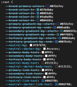
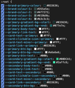
Inspecting a product using the HDS shows the following CSS custom variables:
Default variables
Overridden variables
Variables
Variables work in the same way as colours, but apply to other properties of components, such as a sizes.
// Hero
$hero-content-width--md: 60%;
$hero-content-width--lg: 60%;
$hero-image-width--md: 100%;
$hero-image-width--lg: 50%;
These are available in /source/sass/themes/health/_variables.scss